Quote:
Originally Posted by fabiani12333

Yes, I noticed that too about the closeup artwork -- they have more detail. The X-Men characters in particularly seem to have the highest quality of artwork -- just look at the base artwork for Storm and Kitty Pride. But the canvas portraits seem to be lacking in fine detail, almost like they were blown up and cropped out from a more expansive painting.
And yeah, the lack of background detail is noticeable. I think it's a way to cut time spent on each piece, but it may also be because the media that it's being printed on is so small. Foreground images get more emphasized on trading cards, with background details being harder for the viewer to make out -- too much detail can also make a small trading card look too busy. But full-size paintings do a better job of emphasizing smaller background details -- especially landscape paintings.
|
You are right about the time saving aspect, and also the trading card medium being less conducive. It's especially noticeable in the Battle Spectras which have almost no environments in these. Btw this isnt particular to 2023, but also in prior masterpieces like 2018 and 2020- it's likely not even Dos Santos's choice but UD needs them to have nearly blank backgrounds for the battle spectra gem parallels.
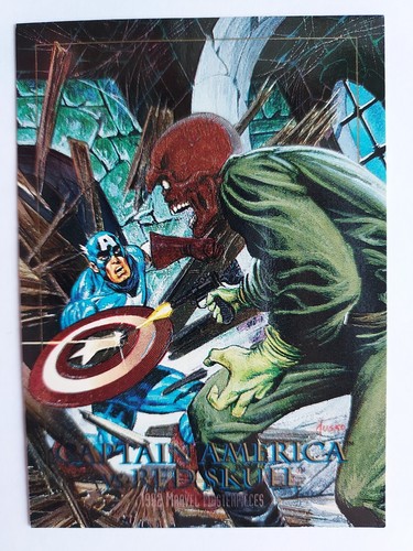
The 92 battle spectras utilized environments quite effectively (but I dont think it'd be easy to make the below into blue, red, green variants by just coloring the background)
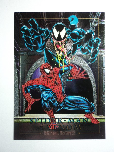
I just noticed the Spider-man vs Venom battle spectra is essentially opposite the 92...this time it's Spiderman attacking Venom from above


A nitpik, the modern Battle Spectras are decidedly
not spectra etch cards. UD doesnt seem to know how to make a proper spectra etch card like Skybox did, which had only certain parts of the characters and backgrounds in etched foil. The new ones are generally a generic foil behind the unfoiled character art.