
|
|
|
|||||||
| FOOTBALL Post your Football Cards Hobby Talk |
 |
|
|
Thread Tools | Display Modes |
 01-03-2024, 03:21 PM
|
#1 |
|
Member

Join Date: Dec 2012
Location: Texan in AZ
Posts: 45,525
|
This has to be a placeholder than accidentally made its way into production, right?
There's no way they they saw a plain white text box and the team name in a basic black font sitting right behind the players' headsthe focal point of the entire cardand said, "yeah, that looks good," right?  It reminds me of the 2017 Optic Rated Rookies when they accidentally left the faded white boxes meant for the autographed versions on the non-autographed base versions.
__________________
 2024 Blowout Awards nomination thread 2024 Blowout Awards nomination thread Hot Glenzy Summer starts now! |

|

|
|
01-03-2024, 03:27 PM
|
#3 |
|
Member
|
I think it looks fine and 2017 optic is one of the better designs imo
__________________
sports card market bubble: 2020-2024 - a flippers wet dream |
|
|
|
|
01-03-2024, 03:44 PM
|
#4 | |
|
Member
Join Date: Dec 2012
Location: Texan in AZ
Posts: 45,525
|
Quote:
No white on baseball:  No white on basketball:  Suddenly we've got a giant whited-out bottom with football...  The same whited-out design used on the autos...  It's ok to love the cards we've been given, but if we're being honest Panini has gotten sloppy numerous times over the years.
__________________
2024 Blowout Awards nomination thread Hot Glenzy Summer starts now! |
|
|
|
|
|
01-03-2024, 03:48 PM
|
#5 |
|
Member

Join Date: May 2016
Location: New York
Posts: 1,177
|
The Prizm logo and team name should have swapped locations on the card design.
Was the design team trying to be edgy, thinking that it would be "too predictable" to have the team name below the player's name? 
|
|
|
|
|
01-03-2024, 03:48 PM
|
#6 |
|
Member

|
You could lay down a common card from just about every year of this set and I'd be lucky to get 2 or 3 right. I know 2012, because of the gold pump, and Mahomes rookie year. 99.9% of these sets won't even matter in a few more years. I see this crap in cases at a show and just keep walking.
__________________
Sent from my Danger Hiptop T-Mobile Sidekick in 2002 |
|
|
|
|
01-03-2024, 03:52 PM
|
#7 |
|
Banned
Join Date: Aug 2019
Posts: 7,603
|
The Prizm design team has been putting out cards their entire existence that looks worse and less sharp than a Topps Chrome card from 20 years ago. No surprise here
|
|
|
|
|
01-03-2024, 03:52 PM
|
#8 |
|
Member

Join Date: Nov 2015
Posts: 14,851
|
I'd say they accidentally messed up, but their body of work is more likely they forgot to unhide some Photoshop layers and they just rolled with it.
__________________
An edgy Fred Rogers with a Ham Cannon splitting a dead horse atom. "The only thing I'm not good at is modesty. Because I'm great at it." -Gina Linetti |
|
|
|
|
01-03-2024, 03:54 PM
|
#9 | |
|
Member
Join Date: Dec 2012
Location: Texan in AZ
Posts: 45,525
|
Quote:

__________________
2024 Blowout Awards nomination thread Hot Glenzy Summer starts now! |
|
|
|
|
|
01-03-2024, 04:02 PM
|
#10 |
|
Member

|
When I saw the first cards listed on eBay, I honestly thought they were fakes because 1) there were sellers with cards a week or two before the release date and 2) how odd the team plate looks on the card.
__________________
Twitter & Instagram: rossisportcards I PC Bethel Johnson (all uniforms) & Adam Vinatieri (Patriots uniform only). AKA Powerup Red |

|
|
|
01-03-2024, 04:07 PM
|
#11 | |
|
Member
Join Date: Dec 2012
Location: Texan in AZ
Posts: 45,525
|
Quote:
2017: Placed at the bottom in a faded, stylized white box with italics text.  2018: Placed at the bottom in a textured white box and again with italics.  2019: Not much going on here, but at least it's at the bottom and there is some gradient texture to the text.  2020: Gradient white text placed in a team color box at the bottom of the card.  2021: Gradient white text in a nicely stylized black box at the bottom of the card.  2022: A stylized black box and the white text has some gradient shading to it at the bottom of the card.  2023: It looks like someone used a label maker and stuck the team name to the card. It's right at the top of the card centered over the player's head and features solid black text over a white box with no gradient around the text. 
__________________
2024 Blowout Awards nomination thread Hot Glenzy Summer starts now! Last edited by TheFrenzy; 01-03-2024 at 04:10 PM. |
|
|
|
|
|
01-03-2024, 04:08 PM
|
#12 |
|
Member

Join Date: Sep 2014
Location: Phoenix, AZ
Posts: 7,802
|
I like the design of the name in black on white but it doesn't fit the card.
It would be better if it wasn't a bright white. Maybe a muted white. Definitely odd. |
|
|
|
|
01-03-2024, 04:08 PM
|
#13 |
|
Member
Join Date: Dec 2012
Location: Texan in AZ
Posts: 45,525
|
For easier comparison, here they are right next to each other:
      
__________________
2024 Blowout Awards nomination thread Hot Glenzy Summer starts now! |
|
|
|
|
01-03-2024, 04:24 PM
|
#14 | |
|
Member
Join Date: Nov 2015
Posts: 14,851
|
Quote:
__________________
An edgy Fred Rogers with a Ham Cannon splitting a dead horse atom. "The only thing I'm not good at is modesty. Because I'm great at it." -Gina Linetti |
|
|
|
|
|
01-03-2024, 04:30 PM
|
#15 | |
|
Member
Join Date: Dec 2012
Location: Texan in AZ
Posts: 45,525
|
Quote:

__________________
2024 Blowout Awards nomination thread Hot Glenzy Summer starts now! |
|
|
|
|
|
01-03-2024, 04:33 PM
|
#16 | |
|
Member
|
Quote:
There is no creativity compared to the different 2017, 2018, 2019 examples you have.
__________________
Twitter & Instagram: rossisportcards I PC Bethel Johnson (all uniforms) & Adam Vinatieri (Patriots uniform only). AKA Powerup Red |
|
|
|
|
|
01-03-2024, 04:58 PM
|
#17 |
|
Member

|
I was in the production meeting, they asked how they to make Prizm even more appealing to gamblers. I raised my hand and said, "What if we put a box with the team name top-center to make it easier for breakers to sweat the live reveal?" I got a twenty-seven cent raise that quarter.
__________________
The stories and information posted here are artistic works of fiction and falsehood. Only a fool would take anything posted here as fact. |
|
|
|
|
01-03-2024, 05:05 PM
|
#18 | |
|
Member
Join Date: Nov 2015
Posts: 14,851
|
Quote:
In the language of Reddit, I would give a +1 angry upvote.
__________________
An edgy Fred Rogers with a Ham Cannon splitting a dead horse atom. "The only thing I'm not good at is modesty. Because I'm great at it." -Gina Linetti |
|
|
|
|
|
01-03-2024, 05:06 PM
|
#19 | |
|
Member
Join Date: Dec 2012
Location: Texan in AZ
Posts: 45,525
|
Quote:
__________________
2024 Blowout Awards nomination thread Hot Glenzy Summer starts now! |
|
|
|
|
|
01-03-2024, 06:35 PM
|
#20 |
|
Member
Join Date: Dec 2012
Location: Texan in AZ
Posts: 45,525
|

__________________
2024 Blowout Awards nomination thread Hot Glenzy Summer starts now! |
|
|
|
|
01-03-2024, 09:08 PM
|
#21 |
|
Member
Join Date: Dec 2012
Location: Texan in AZ
Posts: 45,525
|
2023 Design / Alternative #1 / Alternative #2

__________________
2024 Blowout Awards nomination thread Hot Glenzy Summer starts now! |
|
|
|
|
01-03-2024, 09:41 PM
|
#22 |
|
Member
|
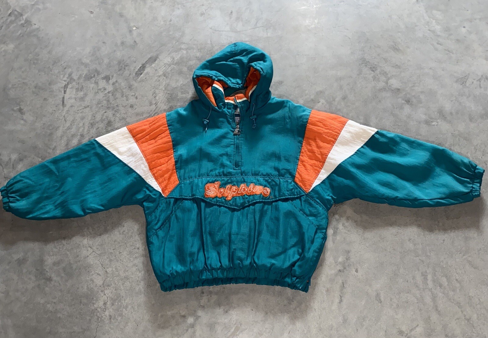
If they insisted on going with team name in that area, the team's specific stylized font would have been nice. Maybe even old school like the Starter jackets:
__________________
The stories and information posted here are artistic works of fiction and falsehood. Only a fool would take anything posted here as fact. |
|
|
|
|
01-03-2024, 09:47 PM
|
#23 | |
|
Member
Join Date: Dec 2012
Location: Texan in AZ
Posts: 45,525
|
Quote:

__________________
2024 Blowout Awards nomination thread Hot Glenzy Summer starts now! |
|
|
|
|
|
01-03-2024, 10:00 PM
|
#24 | |
|
Member
|
Quote:
__________________
The stories and information posted here are artistic works of fiction and falsehood. Only a fool would take anything posted here as fact. |
|
|
|
|
|
01-03-2024, 10:03 PM
|
#25 | |
|
Member

|
Quote:
__________________
"If you reply with...."last one on eBay sold for this"...then you should have bought it on eBay." - Anonymous |
|
|
|
|
|
| Bookmarks |
|
|


 Linear Mode

