
|
|
|
|||||||
| BASEBALL Post your Baseball Cards Hobby Talk |
 |
|
|
Thread Tools | Display Modes |
 02-01-2025, 11:07 AM
|
#151 |
|
Member

|
Wow that Ohtani super. Very nice.
__________________
They're = they are. Their = possession. There = "I went there." Two = 2. Too = "Me too." To = "He went to the card show." Your = "your cards." You're = "you're welcome." |

|

|
|
02-14-2025, 07:32 PM
|
#153 |
|
Member
|
I’m liking the looks of these so far! Seems like they did a good job respecting the design of the border.
__________________
'20 Heritage /571 & /999 - 69%
'16-Present Chrome Cardinals Purple/Pink/Refractor - 58.9% |
|
|
|
|
02-14-2025, 10:07 PM
|
#154 |
|
Member
Join Date: Apr 2023
Posts: 141
|
A bunch of mine from 2025 jumbos were totally off center, but they look nice otherwise.
Also I wish they had kept purple /75. Ah well. |
|
|
|
|
02-15-2025, 02:44 PM
|
#155 | |
|
Member
Join Date: Mar 2021
Location: California
Posts: 7,040
|
Quote:
|
|
|
|
|
|
02-15-2025, 05:12 PM
|
#156 |
|
Member
Join Date: Jan 2020
Location: Collegeville PA
Posts: 1,888
|
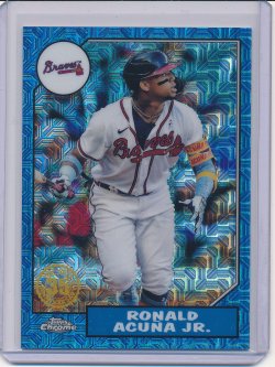
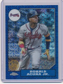
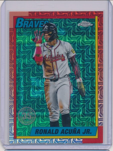
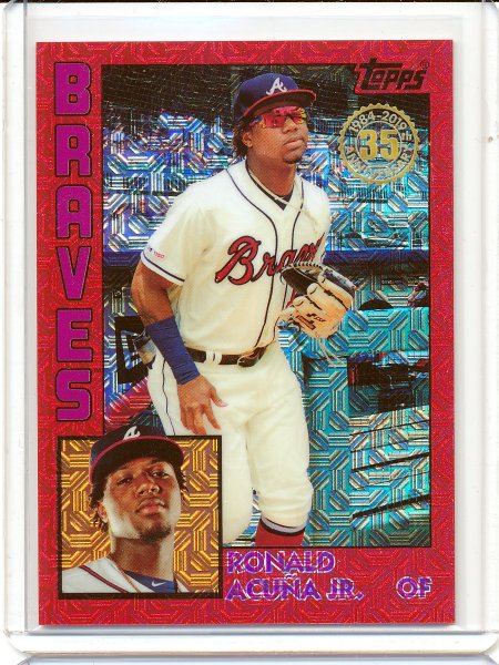
I’m not a fan of how the colored parallels are tinted inside the borders this year. I get that ‘90 Topps had different color borders than other ‘80’s cards, which makes it more difficult, but I wish they had figured out a better way to do the parallels. Maybe just solid all around….
|
|
|
|
|
03-03-2025, 09:10 PM
|
#157 |
|
Member

Join Date: Jun 2020
Location: Florida
Posts: 14,000
|
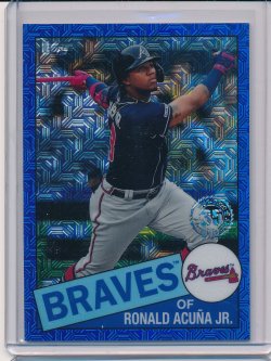
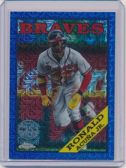
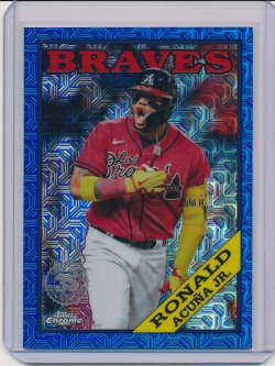
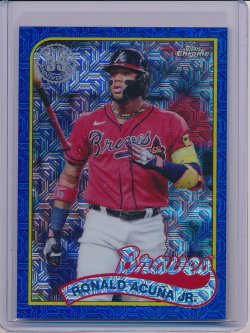
Latest Silver Pack addition

|

|
|
|
03-04-2025, 01:24 AM
|
#158 |
|
Member

Join Date: Feb 2017
Location: Tempe, AZ
Posts: 8,520
|
Anybody seen this year's in hand? From the pictures the base is solid, but the color looks terrible.
__________________
Me: Did I win? Gixen: Yes. You won. Now you're broke. |
|
|
|
|
03-04-2025, 11:49 AM
|
#159 | |
|
Member

Join Date: Mar 2024
Location: GA
Posts: 516
|
Quote:
|
|
|
|
|
|
03-04-2025, 12:02 PM
|
#160 |
|
Member
Join Date: Sep 2016
Location: Wisconsin
Posts: 543
|
 Sigh wish I still had it. First super I ever pulled. Sent from my iPhone using Tapatalk |
|
|
|
|
03-04-2025, 12:39 PM
|
#161 | |
|
Member
Join Date: Jan 2020
Location: Collegeville PA
Posts: 1,888
|
Quote:
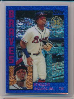
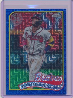
heres an orange one. I have a few aqua /199s too, but theyre kind of hard to distinguish from the base. I dont like how theyve tinted inside the borders, although the 90 design makes it difficult to color the borders instead. In short, I like the base, but not the parallels.  Sent from my iPad using Tapatalk |
|
|
|
|
|
03-06-2025, 01:03 AM
|
#163 | |
|
Member
Join Date: Feb 2017
Location: Tempe, AZ
Posts: 8,520
|
Quote:
__________________
Me: Did I win? Gixen: Yes. You won. Now you're broke. |
|
|
|
|
|
03-06-2025, 09:00 AM
|
#164 | |
|
Member
|
Quote:
__________________
'20 Heritage /571 & /999 - 69%
'16-Present Chrome Cardinals Purple/Pink/Refractor - 58.9% |
|
|
|
|
|
03-06-2025, 03:54 PM
|
#165 | |
|
Member

|
Quote:
__________________
Sean Taylor/Craig Kimbrel/Brian Orakpo Collector! https://sportscardalbum.com/u/rabs Last edited by Rabs; 03-07-2025 at 01:08 PM. |
|
|
|
|
|
03-06-2025, 05:20 PM
|
#166 | |
|
Member
Join Date: Mar 2021
Location: California
Posts: 7,040
|
Quote:
|
|
|
|
|
|
03-07-2025, 12:19 AM
|
#167 | |
|
Member
|
Quote:
That reminds me... I'm missing '22 and '24 S2 as well! Yeesh! All the more impressive!
__________________
'20 Heritage /571 & /999 - 69%
'16-Present Chrome Cardinals Purple/Pink/Refractor - 58.9% |
|
|
|
|
|
03-07-2025, 07:08 AM
|
#168 |
|
Member

Join Date: May 2024
Location: Frisco, TX
Posts: 353
|
Just found this thread. Always have enjoyed the silver pack cards!
 Sent from my iPhone using Tapatalk |
|
|
|
|
03-07-2025, 11:49 AM
|
#169 |
|
Member
Join Date: May 2024
Location: Frisco, TX
Posts: 353
|
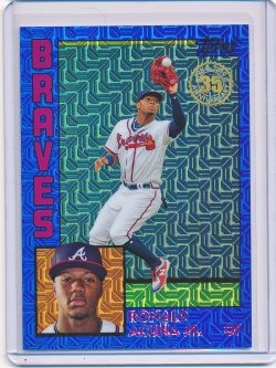
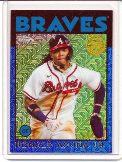
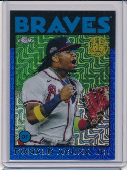
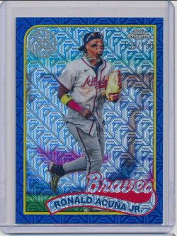
The 90s cards look good as chrome, but still sure about the color variations.
My sons that he pulled on release day.  Sent from my iPhone using Tapatalk |
|
|
|
|
03-07-2025, 01:12 PM
|
#170 | ||
|
Member
|
Quote:
Quote:
I actually left out the 2021 Series 2 Blue I had. It's pictured now. Only one I need is the 2025 which I will pick up at some point.
__________________
Sean Taylor/Craig Kimbrel/Brian Orakpo Collector! https://sportscardalbum.com/u/rabs |
||
|
|
|
|
06-10-2025, 06:17 PM
|
#172 |
|
Member

Join Date: May 2020
Location: CA
Posts: 585
|
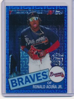
The 1990 silver packs look great imo but the parallels are SO BAD! bums me out big time, and the all-Stars parallels in series 2 look real bad in a worse way.
|
|
|
|
|
06-10-2025, 10:22 PM
|
#173 | |
|
Member
Join Date: Apr 2023
Posts: 141
|
Quote:
|
|
|
|
|
|
06-10-2025, 10:36 PM
|
#174 | |
|
Member
Join Date: Feb 2009
Location: Seattle, WA
Posts: 17,875
|
Quote:
After the 1990 design, there's arguably not another decent design until 2009 or 2010.... |
|
|
|
|
|
| Bookmarks |
|
|


 Linear Mode

