
|
|
 01-09-2025, 09:40 AM
|
#1 |
|
Member
Join Date: Oct 2020
Posts: 963
|
(Starting a new thread here)
Here's Aaron Judge on Topps' flagship product for this year. 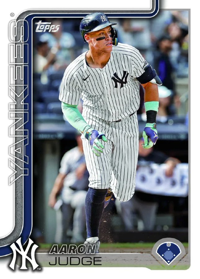 I'm getting 2019 Topps vibes here (which I wasn't super thrilled with). I wish they went back to the full bleed like they had between 2016-2018 (and then again in 2020). Not a huge fan at this point - but I wasn't when I first saw 2024 and I really like those now. Same with 2008. Maybe these will grow on me. |

|

|
|
01-09-2025, 09:40 AM
|
#2 |
|
Member

Join Date: Jun 2020
Location: Florida
Posts: 13,744
|
It’s fine. I like it, not an all-timer for me though.
|

|
|
|
01-09-2025, 09:42 AM
|
#3 |
|
Member
Join Date: Jun 2020
Location: Florida
Posts: 13,744
|
I need to see what the Indy #/76 parallels look like before passing final judgement.
|
|
|
|
|
01-09-2025, 09:42 AM
|
#4 | |
|
Member

|
Quote:
__________________
https://myslabs.to/brasm_sports5 https://www.ebay.com/str/jrbuddysportsandmore |
|
|
|
|
|
01-09-2025, 09:42 AM
|
#5 |
|
Member

Join Date: Apr 2019
Posts: 5,122
|
Reminiscent of 1982.

__________________
https://gallery.us175.com/  https://inv.us175.com/wantlist |
|
|
|
|
01-09-2025, 09:42 AM
|
#6 |
|
Member
Join Date: Oct 2020
Posts: 963
|
Kinda a hybrid of 1982 and 1984 (with a little bit of 2019) as well:
Last edited by Handsome Wes; 01-09-2025 at 09:46 AM. |
|
|
|
|
01-09-2025, 09:44 AM
|
#7 | |
|
Member
Join Date: Oct 2020
Posts: 963
|
Quote:
|
|
|
|
|
|
01-09-2025, 09:44 AM
|
#8 |
|
Member
|
My first thought is that the same person who designed the 2024 Brooklyn base designed this.
|
|
|
|
|
01-09-2025, 09:44 AM
|
#9 |
|
Member

Join Date: Jul 2019
Location: San Antonio
Posts: 8,151
|
I really like it!
But, the Diamond Dot scheme is meh.
__________________
Primarily retired from collecting, but doing a Greatest Sho-man binder thing. I do love California Angels baseball. |
|
|
|
|
01-09-2025, 09:45 AM
|
#10 |
|
Member

Join Date: May 2024
Location: Frisco, TX
Posts: 338
|
Interesting how position is noted in the diamond in the corner.
Sent from my iPhone using Tapatalk |
|
|
|
|
01-09-2025, 09:51 AM
|
#11 |
|
Member

Join Date: Jun 2013
Location: King George, VA
Posts: 78,780
|
It looks nice other than the position designator. Where are they going to place a DH on that. At the plate?
|
|
|
|
|
01-09-2025, 09:53 AM
|
#12 | |
|
Member
Join Date: Mar 2011
Posts: 14,969
|
Quote:
|
|
|
|
|
|
01-09-2025, 09:55 AM
|
#14 |
|
Member
Join Date: Oct 2013
Posts: 3,527
|
It's cardbaord.. Sheep will still buy it
|
|
|
|
|
01-09-2025, 09:57 AM
|
#15 |
|
Member

|
Looks fine. The only thing that bugs me is the last curve from the pipe along the top feels out of place. I think it would look better if it would just end at the border of the picture rather than the card. Throws off the centering of the picture for me.
Or just extend it horizontally to the edge that way. The abrupt curve to the top seems odd. |
|
|
|
|
01-09-2025, 10:04 AM
|
#16 | |
|
Member
Join Date: Jun 2020
Location: Florida
Posts: 13,744
|
Quote:
|
|
|
|
|
|
01-09-2025, 10:05 AM
|
#17 | |
|
Member
Join Date: May 2024
Location: Frisco, TX
Posts: 338
|
Quote:
Trolls gotta troll Sent from my iPhone using Tapatalk |
|
|
|
|
|
01-09-2025, 10:06 AM
|
#18 |
|
Member

Join Date: Dec 2022
Location: Big City
Posts: 1,824
|
Anything was going to be a departure from 2024. It's interesting. I guess my first take (after it being similar to Brooklyn) is that is has a solid but forgettable mid-90s workout clothes aesthetic. Like some Champion sweats.
|
|
|
|
|
01-09-2025, 10:07 AM
|
#19 |
|
Member
Join Date: Dec 2022
Location: Big City
Posts: 1,824
|
I want to see the backs.
|
|
|
|
|
01-09-2025, 10:07 AM
|
#20 |
|
Member

|
I like it, minus the position icon in the bottom right
__________________
Collecting the Twins
All my PC wants/haves available at hollywood42cards.com |
|
|
|
|
01-09-2025, 10:09 AM
|
#21 |
|
Member
Join Date: Jan 2008
Posts: 13,753
|
im guessing every grader at PSA is going interpret the L/R centering differently and grades will be random.
|
|
|
|
|
01-09-2025, 10:18 AM
|
#22 |
|
Member

Join Date: Jan 2015
Location: fresno
Posts: 5,160
|
Ok I'll say it. That design is ugly as hell.
__________________
Why the hell are you buying Siemian stuff. Dude is done, can't you tell I'm trying to get rid of him because he'll never be our starting QB again.... |
|
|
|
|
01-09-2025, 10:24 AM
|
#24 | |
|
Member

Join Date: Sep 2019
Location: Long Island, NY
Posts: 4,323
|
Quote:
__________________
BO Resident TAG Grading shill |
|
|
|
|
 |
| Bookmarks |
|
|


 Linear Mode

